Picture the actual moment. It is 7 PM. A homeowner noticed a stain on the bedroom ceiling this morning and has been thinking about it all day. Dinner is done. She is on the couch with a phone in one hand, the TV on, half paying attention. She searches, taps three roofers in a row, and gives each one a few seconds.
That is the real test environment. Not your 27-inch monitor at 10 AM with fiber internet. A tired person, one thumb, mediocre signal, competing for attention with a television.
Most contractor sites are built and reviewed on desktop and then "checked" on mobile at the end. You can feel it immediately.
The first screen has one job
When the page loads on a phone, before any scrolling, she should be able to answer three questions in about two seconds:
- What do you do?
- Do you work where I live?
- How do I reach you right now?
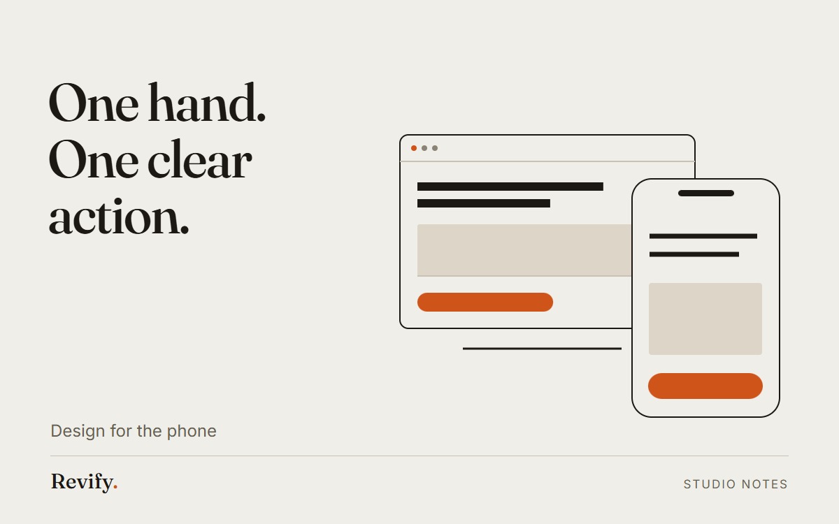
That means the first screen holds a plain headline (roofing, and the metro area), one photo of real work, and a tap-to-call button. Not a slideshow. Not a video that eats four seconds of loading. Not a cookie banner plus a chat bubble plus a discount popup arriving in sequence like a series of small ambushes.
If she has to scroll to find out what city you serve, you have already lost to the guy who put it in the headline.
Thumb reach is a real constraint
Hold your phone the way you actually hold it. The comfortable zone is the bottom half of the screen. The top corners require a hand adjustment, which people do not bother making for a business they have not decided to trust yet.
Practical rules:
- Put the primary action in the bottom third, or pin a persistent call bar to the bottom edge.
- Tap targets no smaller than about 44 by 44 pixels, with real space between them. Two links stacked eight pixels apart produce misfires, and a misfire feels like the site is broken.
- Phone numbers must be tap-to-call links. A number you have to select, copy and paste is a number that does not get dialed at 7 PM.
Text people can read without squinting
Body text at 16 to 18 pixels, line length that does not run edge to edge, and enough contrast that it survives a kitchen with one lamp on. Grey text on a slightly lighter grey background is a designer habit that costs contractors money.
Also: nothing horizontal. If any element forces sideways scrolling, usually a wide table, a big image, or a long unbroken phone number, the whole page feels amateurish in a way people cannot articulate but definitely register.
Speed is a trust signal, not a technical metric
On a phone, on cell data, every second before something appears is a second she might tap back. Three roofers are open in three tabs. The slowest one loses by default.
What usually causes the slowness on contractor sites, roughly in order:
- Enormous unoptimized photos straight off a phone camera, four megabytes each.
- Video backgrounds in the hero.
- A stack of third-party scripts: chat widget, review widget, analytics, pixel, popup tool, all loading before the content.
- Fonts loading from three different places.
Fix the photos first. Resize to what actually displays, serve modern formats, and lazy-load anything below the first screen. That one change frequently does more than everything else combined.
The form should be short enough to finish one-handed
Every field you add on mobile is a small tax paid with a thumb. Name, phone, and "what is going on" gets you a callable lead. Address, preferred contact time, how did you hear about us, roof age, and a dropdown of eleven service types gets you an abandoned form.
Ask for the rest on the phone. You are a person who talks to homeowners for a living. That is your advantage over the form.
And when the form is submitted, say something human immediately, and follow with a text within a minute or two. The Harvard Business Review study on online sales leads found that firms responding within an hour were about seven times more likely to qualify the lead than those who waited an additional hour. At 7 PM, the difference between two minutes and two hours is the difference between being the roofer she talked to and the roofer she meant to call back.
How to test this honestly
Hand your phone to someone who does not work for you. Do not explain anything. Ask them to find out whether you serve their neighborhood and then reach you. Watch where their thumb hesitates.
That ten-minute exercise will tell you more than any report.
Curious how your homepage would handle that 7 PM test? We build the real thing in 48 hours, free to look at.