We work from Austevoll, a cluster of islands south of Bergen. Fishing, aquaculture, boatbuilding, weather. Our clients are roofers in Wichita and HVAC companies in Tampa. That distance comes up in every first conversation, so it is worth explaining what actually travels.
Scandinavian design has been flattened into a mood board - blonde wood, white walls, one plant. That is a look, and looks do not transfer to a plumbing site. The useful part is a set of working principles, and those transfer fine.
Everything on the page has to earn its place
The core discipline is subtraction. Not minimalism for its own sake - Nordic design is not austere, it is uncluttered because clutter is treated as a failure to decide.
On a contractor homepage, that means a specific question gets asked of every element: what is this doing for the homeowner? The award badge from 2014, the second carousel, the mission statement, the stock photo of a handshake, the newsletter popup. Each is on the page because someone added it, not because someone decided it should be there.
Cut those and the things that matter get louder without you shouting. The phone number is more visible on a calm page than on a busy one, no matter how big you make it.
Materials are shown honestly
Norwegian building tradition does not paint pine to look like marble. Wood looks like wood, stone looks like stone, and the joinery is visible.
The web version: use your real photographs, unretouched into plausibility. A crew on a roof in July looks hot and dirty, and that reads as true. The version color-graded into a lifestyle advertisement reads as a stock library. Homeowners are extremely good at detecting the second one, even if they cannot articulate why they distrusted the site.
Same for copy. Family owned since 2004, 11 trucks, we do not subcontract is honest material. Delivering excellence through innovative solutions is paint pretending to be marble.
Light is the hardest constraint
We design in a place where winter daylight is thin and blue for months. That teaches you contrast is not a stylistic choice.
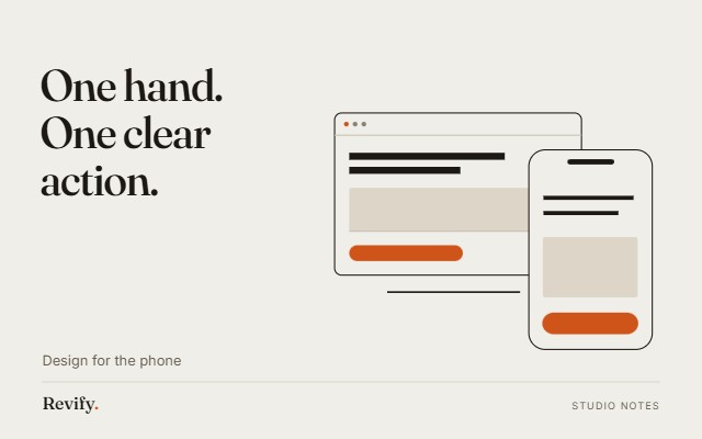
The American trades version of that constraint is different but just as brutal: your homepage will be read on a phone, at arm's length, in direct sunlight, by someone in their fifties standing in a driveway. Grey text on a white background fails that test. So does 14px body copy, thin weights, low-contrast buttons, and anything that depends on hovering.
So we set body text at a size that reads without squinting, keep contrast well above the accessibility floor rather than exactly at it, and make tap targets big enough for a work glove. That is not a decoration decision. It is the same reasoning as building a boat for the sea it will actually be in.
Structure carries the meaning
Good Nordic work relies on proportion, spacing, and hierarchy rather than ornament. On a website that means: one typeface family used well beats four used decoratively; whitespace is what tells you where a section begins and ends; the size of a heading is a statement about its importance and should be true.
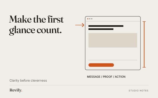
A reader should be able to scroll your homepage at speed, reading only the headings, and come away with the whole argument. If they cannot, the structure is doing nothing and the decoration is doing everything.
Motion should feel like weight
We use motion, but sparingly and always with physics. Things ease in as though they have mass. Nothing bounces, spins, or flies in from off-screen. Transitions are around a second, slow enough to feel considered, quick enough not to be in your way.
The test is whether removing the animation would make the page harder to understand. If the answer is no, it is ornament, and it goes.
What this is not
It is not cold. There is a version of minimalism that strips out all human warmth and leaves a page that could belong to any company in any country - we consider that a failure, not a style. Your site should feel like your company: the crew's faces, the actual town names, the specific way you explain a job to a homeowner.
It is also not sparse to the point of unhelpful. A trades site needs a visible phone number, clear service lists, real prices where you can give them, and obvious next steps. Hiding those behind elegant emptiness is not restraint, it is just a bad site with good taste.
Why it works for trades specifically
Because the entire category signals with volume - bigger fonts, more badges, more exclamation points, urgency banners. When everyone shouts, the calm page is the one that reads as confident, and confidence is exactly what someone wants from the company they are letting onto their roof.
Your work is already careful. The site should look like the same company made both.
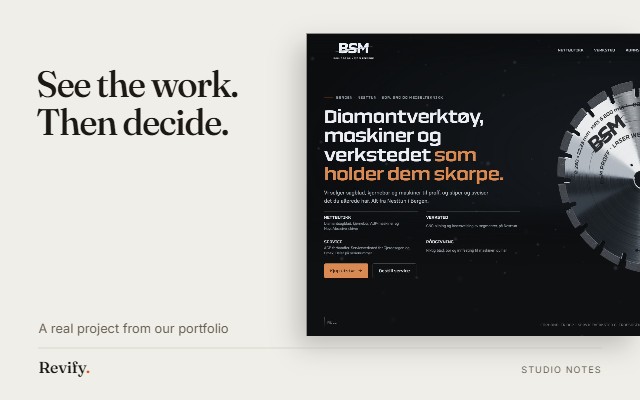
If you want to see your business handled this way, we build the homepage first and you decide after looking at it.